library(sf)        # Simple Features - for reading, writing, and manipulating vector spatial data
library(tmap)      # Thematic Maps - for creating attractive static and interactive maps with layered geographic data
library(stplanr)   # Sustainable Transport Planning - specialised tools for transport analysis and route planning
library(tidyverse) # Grammar of Graphics - powerful and flexible data visualization package
library(ggspatial) # Spatial extensions for ggplot2OD Transport data visualisation
1 Introduction
Building upon the previous session on “Origin-destination data analysis”, we will advance this topic by examining data visualisation techniques for OD transport data.
By the end of this session, you should be able to:
- Load and preprocess origin-destination flow data
- Create visualizations using OD desire lines and proportional symbol maps
- Compare transport flows across different modes (walking, driving, and cycling)
- Analyse and visualise temporal changes in OD flows, using data from the London Cycle Hire System as an example
Before getting your hands on the coding, let’s introduce some important ideas with a short lecture. (see slides)
2 Setup
Below are the packages we will use throughout this practical:
# Set interactive mapping mode
tmap_mode("view")
3 OD Flow Maps Visualisation
OD flow maps are useful for understanding the volume of travel between origins and destinations. In this section, we will:
- Load desire lines (flows) data from a GeoJSON file.
- Visualise these lines with widths or colors proportional to demand.
# Load Demand Data
desire_lines = read_sf("https://github.com/ITSLeeds/TDS/releases/download/22/NTEM_flow.geojson") |>
  select(from, to, all, walk, drive, cycle)

dim(desire_lines)
[1] 502 7# Let's take the top 50 car trips for demonstration
desire_lines_top = desire_lines |>
arrange(desc(drive)) |>
head(50)
# Quick map to see the distribution of car trips
tm_shape(desire_lines_top) +
tm_lines(
lwd = "drive",
lwd.scale = tm_scale_continuous(values.scale = 9)
) +
tm_layout(legend.bg.color = "white")4 Proportional Symbol Flow Maps
Now, let’s illustrate an alternative method: proportional symbols at origin or destination points. This is useful when you want to quickly see where demand is concentrated.
# Summarize total flows by origin

origin_flows = desire_lines |>
  group_by(from) |>
  summarise(
    total_drive = sum(drive, na.rm = TRUE),
    total_walk  = sum(walk, na.rm = TRUE),
    total_cycle = sum(cycle, na.rm = TRUE),
    `% drive` = total_drive / sum(all, na.rm = TRUE),
    geometry = st_centroid(st_union(geometry))
  )

# Simple map with proportional circles for drive volumes

tm_shape(origin_flows) +
  tm_bubbles(
    size = "total_drive",       # bubble size ~ drive volume
    size.scale = tm_scale_intervals(values.scale = 2, values.range = c(0.5, 2)),
    fill = "% drive",
    fill.scale = tm_scale_continuous(values = "brewer.reds")
  ) +
  tm_title("Proportional Symbol Map of Drive Demand by Origin")
Each origin is represented by a circle whose radius and color intensity reflect the total number of driving trips. You can modify palettes, breaks, and scaling to highlight variations.
5 Mode-Specific Analysis
We have have columns walk, drive, cycle in desire_lines. We can map them separately or side-by-side. We can also color lines by the dominant mode.
# Let's create 3 separate maps: drive, walk, cycle
tmap_mode("plot")
m_drive = tm_shape(desire_lines_top) +
  tm_lines(
    lwd = "drive",
    lwd.scale = tm_scale_continuous(values.scale = 9),
    col = "red"
  ) +
  tm_title("Driving Flows")

m_walk = tm_shape(desire_lines_top) +
  tm_lines(
    lwd = "walk",
    lwd.scale = tm_scale_continuous(values.scale = 9),
    col = "green"
  ) +
  tm_title("Walking Flows")

m_cycle = tm_shape(desire_lines_top) +
  tm_lines(
    lwd = "cycle",
    lwd.scale = tm_scale_continuous(values.scale = 9),
    col = "blue"
  ) +
  tm_title("Cycling Flows")

tmap_arrange(m_drive, m_walk, m_cycle, ncol=3)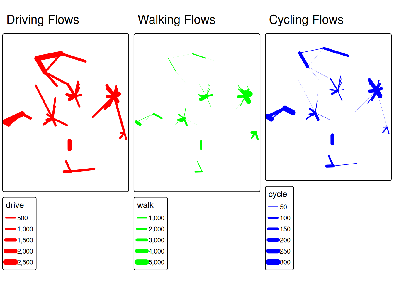
This tmap_arrange() will output a single figure with three columns, each illustrating flows by one mode. Students can visually compare the differences: maybe driving flows are much thicker on longer corridors, while walking flows are concentrated in the city center.
6 Analyisng origin-destination data in London Cycle Hire System
In this section, we will work with origin–destination data from the London Cycle Hire System (LCHS). Specifically, we will examine how a London Underground strike on July 9, 2015 influenced cyclists’ travel patterns.
Public transport disruptions are becoming increasingly common, triggered by various factors including:
- Infrastructure maintenance requirements
- Natural disasters
- Large-scale events (festivals, strikes, etc.)
By analyzing how people adapt their travel patterns during such events, we can better inform urban transport planning and decision-making strategies. To assess how cycling OD patterns change during disruptions, we compare LCHS data from the strike day with two reference days: July 2, 2015 (7 days before) and July 16, 2015 (7 days after).
For this section, we’ll be using cleaned cycling data originally sourced from TfL’s open data portal (cycling.data.tfl.gov.uk).
Let’s begin by loading the following two datasets
# Load bike docking station locations with spatial geometry
bike_docking_stations = read_sf("https://github.com/itsleeds/tds/releases/download/2025/p3-london-bike_docking_stations.geojson")
# Load trip data as regular CSV (no spatial data, but contains origin/destination IDs)
bike_trips = read.csv("https://github.com/itsleeds/tds/releases/download/2025/p3-london-bike_trips.csv")
Explore these datasets using the functions you have learnt (e.g. head, dim)
# Examine the structure and first few rows of each dataset
head(bike_docking_stations)  # Show first 6 rows of station data
Simple feature collection with 6 features and 2 fields
Geometry type: POINT
Dimension: XY
Bounding box: xmin: -0.197574 ymin: 51.49313 xmax: -0.084606 ymax: 51.53006
Geodetic CRS: WGS 84
# A tibble: 6 × 3
station_id station_name geometry
<dbl> <chr> <POINT [°]>
1 1 River Street , Clerkenwell (-0.109971 51.52916)
2 2 Phillimore Gardens, Kensington (-0.197574 51.49961)
3 3 Christopher Street, Liverpool Street (-0.084606 51.52128)
4 4 St. Chad's Street, King's Cross (-0.120974 51.53006)
5 5 Sedding Street, Sloane Square (-0.156876 51.49313)
6 6 Broadcasting House, Marylebone (-0.144229 51.51812)dim(bike_docking_stations) # Show dimensions (rows x columns)[1] 820 3head(bike_trips) # Show first 6 rows of trip data start_time stop_time start_station_id end_station_id
1 2015-07-02 00:00:00 2015-07-02 00:21:00 64 490
2 2015-07-02 00:00:00 2015-07-02 00:11:00 72 439
3 2015-07-02 00:00:00 2015-07-02 00:10:00 87 717
4 2015-07-02 00:00:00 2015-07-02 00:15:00 406 395
5 2015-07-02 00:00:00 2015-07-02 00:24:00 333 103
6 2015-07-02 00:00:00 2015-07-02 00:11:00 666 635dim(bike_trips) # Show dimensions of trip data[1] 144048 4Let’s examine our bike_trips data, which covers three specific Thursdays: July 2nd, July 9th, and July 16th, 2015. July 9th marks the London Underground strike, while the other two dates serve as comparison points one week before and after the strike.
During the Tube Strike, some people adopted bikeshare to replace the Tube travel, hence we should be able to observe some different in trip account.
# Process trip data to identify strike vs non-strike days
bike_trips = bike_trips |>
  mutate(date = date(start_time)) |>  # Extract date from datetime
  mutate(type_day = case_when(
    date == as.Date("2015-07-09") ~ "Strike Day",      # July 9th is strike day
    TRUE ~ "Non-Strike Day"                            # All other days are normal
  ))

# Create bar chart comparing trip counts on different days
bike_trips |>
  group_by(date, type_day) |>    # Group by both date and day type
  summarise(count = n()) |>      # Count number of trips per group
  ggplot() +
  geom_bar(aes(
    x = as.factor(date),         # Date on x-axis (as factor for discrete bars)
    y = count,                   # Trip count on y-axis
    fill = type_day              # Color bars by strike/non-strike day
  ), stat = "identity") +        # Use actual values (not counts of observations)
  xlab("Date") +
  ylab("Count of bike trips") +
  labs(fill = "Type of day")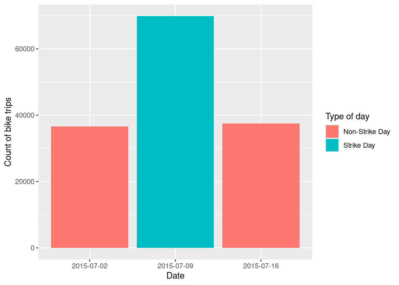
The increase in trips is likely unevenly distributed by time, so it would be useful to examine the changes and differences by hour. This will help us identify when the most significant changes occur.
# Analyse hourly patterns across the three days
bike_trips |>
  mutate(
    hour = hour(start_time),     # Extract hour from start time
    date = as.factor(date)       # Convert date to factor for grouping
  ) |>
  group_by(date, hour) |>        # Group by date and hour
  summarise(count = n()) |>      # Count trips per hour per day
  ggplot() +
  geom_line(aes(x = hour, y = count, color = date, group = date),
            size = 1, alpha = .6) +                    # Line
  geom_point(aes(x = hour, y = count, color = date),
             size = 2) +                               # Add points for emphasis
  scale_x_continuous(breaks = seq(0, 23, by = 4))     # Show every 4th hour on x-axis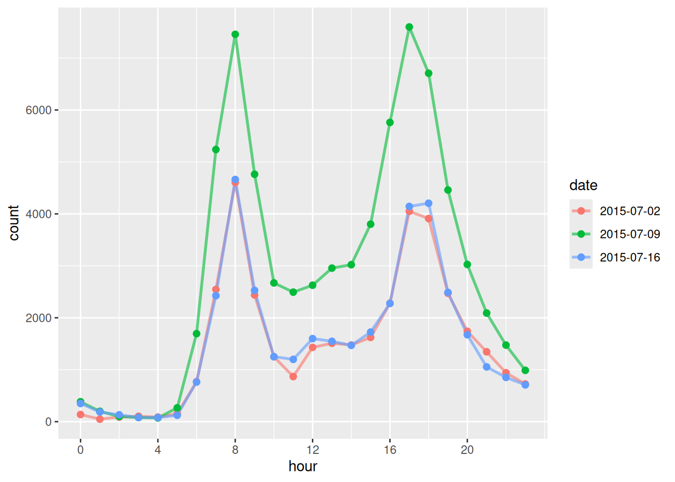
Whist above temporal analysis provide useful summaries, visual analysis of the origin-destination flow changes allow us to characterise with greater richness the nature of changes in response to the strike events. Let’ try to calculate the changes in od flow and map them!
To break the task down, we will 1. Calculate the frequeny of each origin-destination pair on the strike day 2. Calculate the average frequancy of each origin-destination pair on the non-strike day 3. find out the differences
# 1. Calculate trip frequencies for each O-D pair on strike day
od_strike = bike_trips |>
  filter(type_day == "Strike Day") |>                 # Only strike day data
  group_by(start_station_id, end_station_id) |>       # Group by origin-destination pairs
  summarise(count_strike = n())                       # Count trips for each O-D pair

# 2. Calculate average trip frequencies for each O-D pair on non-strike days
od_non_strike = bike_trips |>
  filter(type_day == "Non-Strike Day") |>             # Only non-strike day data
  group_by(start_station_id, end_station_id) |>       # Group by origin-destination pairs
  summarise(count_non_strike = n() / 2)               # Divide by 2 since we have 2 non-strike days
To obtain the changes, we will need to join the origin-destination pairs in the two dataframe we just created.
The dplyr package provides a family of intuitive join functions:
| Join Type | Function | Description |
|---|---|---|
| Inner Join | inner_join(df1, df2, by = "key") |
Keeps only matching rows in both datasets. |
| Left Join | left_join(df1, df2, by = "key") |
Keeps all rows from df1, adds matching rows from df2. |
| Right Join | right_join(df1, df2, by = "key") |
Keeps all rows from df2, adds matching rows from df1. |
| Full Join | full_join(df1, df2, by = "key") |
Keeps all rows from both datasets. |
| Semi Join | semi_join(df1, df2, by = "key") |
Keeps rows from df1 that have matches in df2. |
| Anti Join | anti_join(df1, df2, by = "key") |
Keeps rows from df1 that do not have matches in df2. |
# Join the two dataframes to compare strike vs non-strike patterns
od_change = full_join(od_strike, od_non_strike,
                      by = c("start_station_id", "end_station_id")) |>
  replace_na(list(count_strike = 0, count_non_strike = 0))  # Replace NA with 0

# Calculate the change in trip count and remove self-loop trips
od_change = filter(od_change, start_station_id != end_station_id) |>  # Remove trips from station to itself
  mutate(count_change = count_strike - count_non_strike) |>           # Calculate difference
  arrange(desc(count_change))                                         # Sort by largest increases first
Let have a look at the joined result:
head(od_change) # Show the OD pairs with largest increases in trips# A tibble: 6 × 5
# Groups: start_station_id [6]
start_station_id end_station_id count_strike count_non_strike count_change
<int> <int> <int> <dbl> <dbl>
1 14 109 29 5.5 23.5
2 406 303 36 17 19
3 55 109 18 1.5 16.5
4 307 191 35 18.5 16.5
5 427 109 14 0.5 13.5
6 197 194 15 2 13 We have succesfully joined the data, and the output od_change has both the trip count on strike day (count_strike) and non-strike day (count_non_strike), in addition, a new variable of count_change is created. Next, let clean the output further and create the od lines
# Focus on inter-station trips (not self-loops) and sort by change
od_inter_change = filter(od_change, start_station_id != end_station_id) |>
  arrange(desc(count_change))

# Create spatial lines connecting origin-destination pairs
# od2line() function from stplanr package creates desire lines from O-D data
change_desire_lines = od2line(od_change, bike_docking_stations)
We are particularly interested in identifying origin-destination pairs where the number of trips has increased. To focus on these, we use the filter function to select desire lines with at least one additional trip on the strike day. You can adjust the threshold (currently set to 1) as needed.
# Filter to show only O-D pairs that increased during the strike
change_to_plot = change_desire_lines |>
  filter(count_change >= 1) |>      # Only show increases of 1 or more trips
  arrange((count_change))             # Sort from small to largest increase
# Create a map showing changes in bike trip patterns during the strike
ggplot() +
geom_sf(
data = change_to_plot,
aes(
colour = count_change, # Line color represents magnitude of change
alpha = count_change, # Line transparency based on change magnitude
linewidth = count_change # Line thickness based on change magnitude
)
) +
scale_colour_viridis_c(option = "C") + # Viridis color palette
scale_linewidth_binned(range = c(0.01, 1.6), guide = "legend") + # Set line width range
scale_alpha(range = c(0.001, 0.7), guide = "legend") + # Set transparency range
annotation_scale(location = "br", width_hint = 0.3) + # Add scale bar (bottom right)
annotation_north_arrow(
location = "tl", which_north = "true", # Add north arrow (top left)
style = north_arrow_fancy_orienteering()
) +
theme_void() # Remove axis labels and background grid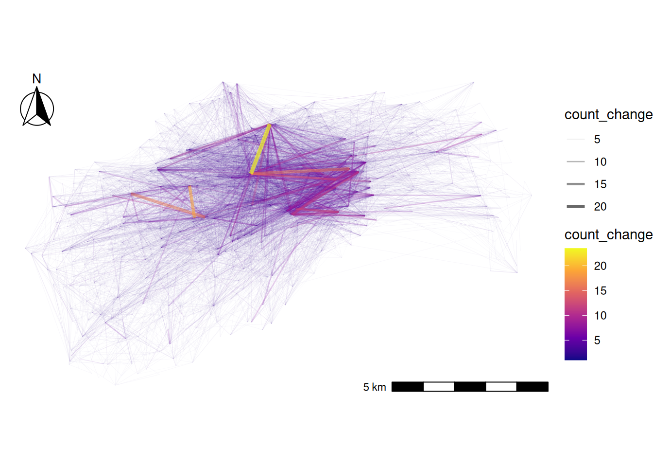
To enhance the map, adding some background context could be useful. Let’s try incorporating the River Thames and green spaces (parks) in central London.
Let’s check how the background looks. You can also customize the colors of the rivers and parks by modifying the values assigned to fill and color.
# Load background geographic features for context
rivers = st_read("https://github.com/itsleeds/tds/releases/download/2025/p3-london-rivers.geojson")
Reading layer `rivers' from data source
`https://github.com/itsleeds/tds/releases/download/2025/p3-london-rivers.geojson'
using driver `GeoJSON'
Simple feature collection with 3 features and 0 fields
Geometry type: GEOMETRYCOLLECTION
Dimension: XY
Bounding box: xmin: -0.2391075 ymin: 51.4639 xmax: 0.0002165973 ymax: 51.50991
Geodetic CRS: WGS 84parks = st_read("https://github.com/itsleeds/tds/releases/download/2025/p3-london-parks.geojson")Reading layer `parks' from data source
`https://github.com/itsleeds/tds/releases/download/2025/p3-london-parks.geojson'
using driver `GeoJSON'
Simple feature collection with 288 features and 10 fields
Geometry type: MULTIPOLYGON
Dimension: XY
Bounding box: xmin: -0.2391075 ymin: 51.44964 xmax: 0.0002165973 ymax: 51.55098
Geodetic CRS: WGS 84# Preview the background features
ggplot() +
geom_sf(data = parks, fill = "#d9f5e0", color = "#d9f5e0") + # Light green for parks
geom_sf(data = rivers, color = "#08D9D6", linewidth = 3) + # Cyan for River Thames
theme_void()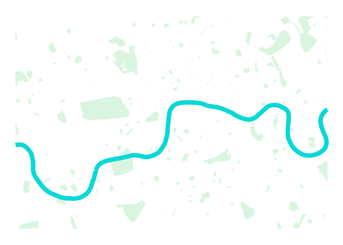
Now, let’s bring the origin-destination desire lines and the base map together! Can you identify key locations where bike trip origin-destination changes are most significant?
# Define the O-D pairs to visualize (increases of 1+ trips)
change_to_plot = change_desire_lines |>
  filter(count_change >= 1) |>
  arrange(count_change)

# Create comprehensive map with background context and O-D flows
ggplot() +
  # Add background features first (they appear behind other layers)
  geom_sf(data = parks, fill = "#d9f5e0", color = "#d9f5e0") +    # Parks as light green areas
  geom_sf(data = rivers, color = "#08D9D6", linewidth = 3) +      # River Thames in cyan

  # Add the desire lines showing changes in bike trips
  geom_sf(
    data = change_to_plot,
    aes(
      colour = count_change,        # Color intensity shows magnitude of change
      alpha = count_change,         # Transparency shows magnitude of change
      linewidth = count_change      # Line thickness shows magnitude of change
    )
  ) +
  scale_colour_viridis_c(option = "C") +                          # Viridis color scale
  scale_linewidth_binned(range = c(0.01, 1.6), guide = "legend") +
  scale_alpha(range = c(0.001, 0.7), guide = "legend") +
  annotation_scale(location = "br", width_hint = 0.3) +           # Scale bar
  annotation_north_arrow(
    location = "tl", which_north = "true",
    style = north_arrow_fancy_orienteering()
  ) +                                                              # North arrow
  theme_void()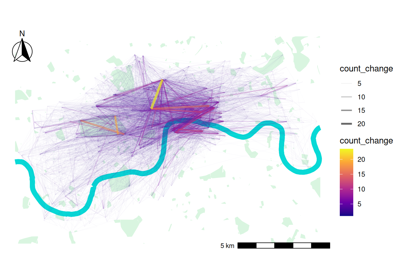
7 Spatial Analyis on bike trip departures
During the Tube strike, bike docking stations closer to Tube stations are likely to experience higher travel activity than those farther away.
To quickly assess whether there is a difference, we can create a buffer around Tube stations and calculate the number of trips originating from bike docking stations within the buffer zone. We can then compare these figures to those from docking stations outside the buffer zone.
First, let create the buffer zones for tube stations in central london
# Load Tube station locations
tube_stations = read_sf("https://github.com/itsleeds/tds/releases/download/2025/p3-london-tube_stations.geojson")

# Crop Tube stations to central London area (where bike docking stations are located)
# st_crop() clips the Tube stations to the bounding box of bike docking stations
tube_stations_central_london = st_crop(tube_stations, st_bbox(bike_docking_stations))

# Create 250m buffer zones around each Tube station
# You can adjust the buffer range to a smaller or larger distance
# st_transform(27700) converts to British National Grid (meters) for accurate distance calculation
# st_buffer() creates circular zones around each point
tube_stations_central_london_buffer = st_buffer(
  tube_stations_central_london %>% st_transform(27700),
  dist = 250  # 250 meter radius buffer
)
You may have noticed that we created a buffer for each Tube station. We can merge all the buffers geometry into a single geometry.
st_union() is a function in the sf package in R, used to merge or dissolve geometries into a single geometry. It is commonly used in spatial data processing when you need to combine multiple polygons, lines, or points into one.
# Merge all individual Tube station buffers into one continuous area
# This creates a single polygon covering all areas within 250m of any Tube station
tube_stations_central_london_buffer_merged = st_union(tube_stations_central_london_buffer)
tube_stations_central_london_buffer_merged = st_union(tube_stations_central_london_buffer)# Switch back to interactive mapping mode
tmap_mode("view")
# Create layered map showing Tube stations, their buffer zones, and bike docking stations
tm_shape(tube_stations_central_london_buffer_merged) +
tm_fill(col = "#3ba2c7", alpha = 0.3, border.col = "#3ba2c7", border.alpha = 0.5) + # Semi-transparent blue buffer
tm_shape(tube_stations_central_london) +
tm_dots(col = "#3ba2c7", size = 0.3, shape = 21, border.col = "white") + # Blue dots for Tube stations
tm_shape(bike_docking_stations) +
tm_dots(fill = "#d45b70", size = 0.3, shape = 19) + # Red dots for bike stations
tm_layout(
frame = FALSE,
title = "Tube Station Catchment Areas and Bike Docking Stations"
)# Alternative visualization using ggplot2
ggplot()+
geom_sf(data = tube_stations_central_london_buffer_merged,
fill ="#3ba2c7", color = NA, alpha =0.3)+ # Buffer zones in blue
geom_sf(data = tube_stations_central_london, color = "#3ba2c7")+ # Tube stations in blue
geom_sf(data = bike_docking_stations, color = "#d45b70", size = 0.5) # Bike stations in red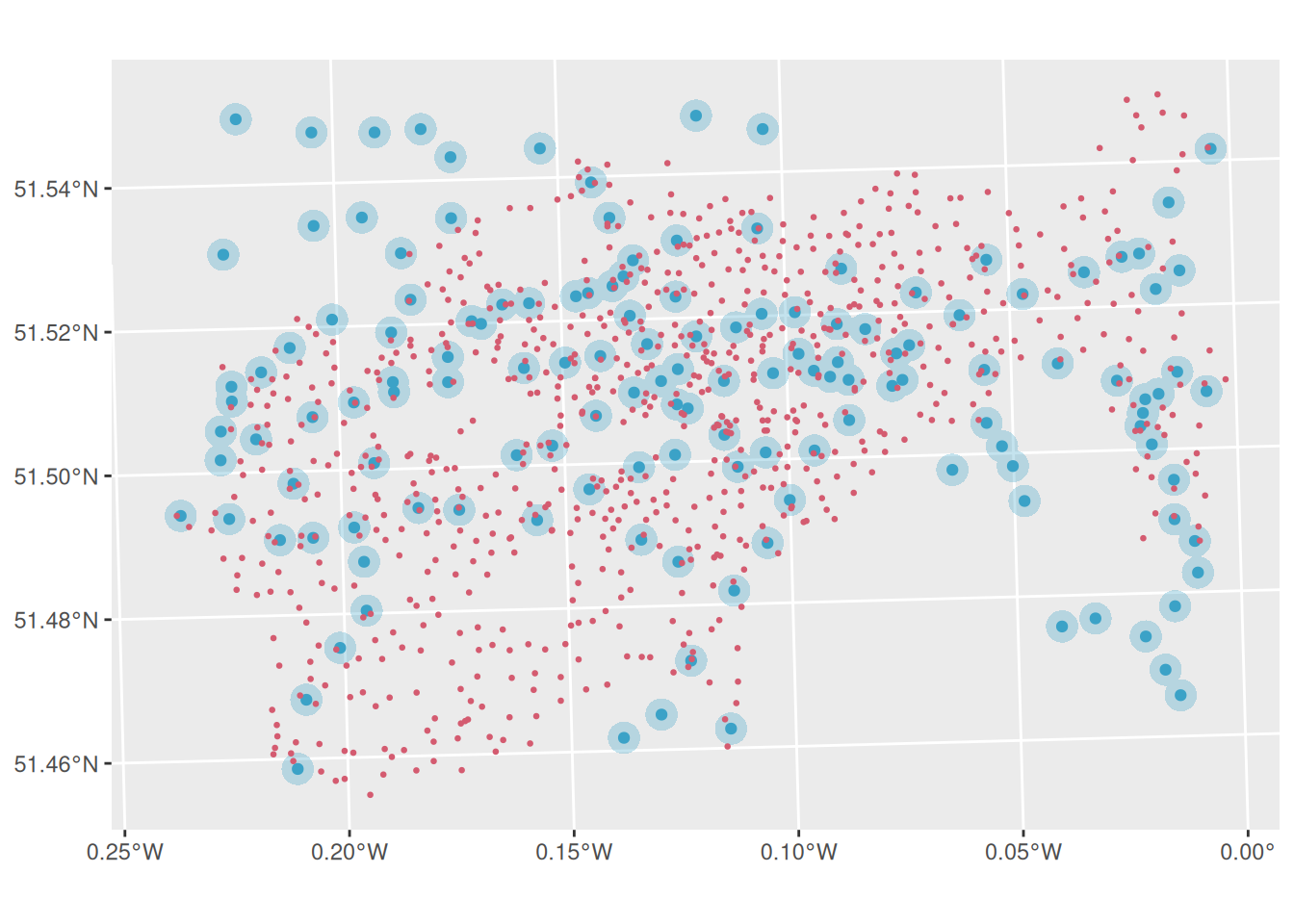
Since we have obtained the merged buffer, let’s find out which bike docking stations fall inside the buffer. To achieve this, we can use the st_within() function. st_within() checks if one geometry is completely inside another geometry.
We also need to create a new column for the bike_docking_stations to store the result from st_within()
# Determine which bike docking stations are within 250m of a Tube station
bike_docking_stations = bike_docking_stations |>
  mutate(inside_tube_buffer = st_within(
    bike_docking_stations,                                        # Check these points
    tube_stations_central_london_buffer_merged %>% st_transform(4326),  # Against this polygon
    sparse = FALSE                                                # Return logical vector (not sparse matrix)
  ))

head(bike_docking_stations)  # View the results
Simple feature collection with 6 features and 3 fields
Geometry type: POINT
Dimension: XY
Bounding box: xmin: -0.197574 ymin: 51.49313 xmax: -0.084606 ymax: 51.53006
Geodetic CRS: WGS 84
# A tibble: 6 × 4
station_id station_name geometry inside_tube_buffer[,1]
<dbl> <chr> <POINT [°]> <lgl>
1 1 River Street , Cl… (-0.109971 51.52916) FALSE
2 2 Phillimore Garden… (-0.197574 51.49961) FALSE
3 3 Christopher Stree… (-0.084606 51.52128) FALSE
4 4 St. Chad's Street… (-0.120974 51.53006) TRUE
5 5 Sedding Street, S… (-0.156876 51.49313) TRUE
6 6 Broadcasting Hous… (-0.144229 51.51812) FALSE As you can see, the bike_docking_stations now has a column named inside_tube_buffer, which contains binary outcome.
Let’s plot them and use inside_tube_buffer for the colour of the bike docking staions.
# Map showing which bike stations are near Tube stations (inside buffer zone)
tm_shape(tube_stations_central_london_buffer_merged) +
  tm_fill(col = "#3ba2c7", alpha = 0.3) +                                    # Buffer zones
tm_shape(bike_docking_stations) +
  tm_dots(
    col = "inside_tube_buffer",                                              # Color by buffer status
    size = 0.3,
    palette = c("FALSE" = "#d45b70", "TRUE" = "#2E8B57"),                   # Red for outside, green for inside
    title = "Inside Buffer"
  ) +
tm_layout(frame = FALSE)
# Alternative ggplot visualization
ggplot()+
geom_sf(data = tube_stations_central_london_buffer_merged,
fill ="#3ba2c7", color = NA, alpha =0.3)+ # Buffer zones
geom_sf(data = bike_docking_stations,
aes(color = inside_tube_buffer), # Color by buffer status
size = 1)+
scale_color_manual(values = c( "#d45b70", "#2E8B57") )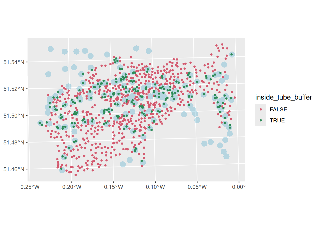
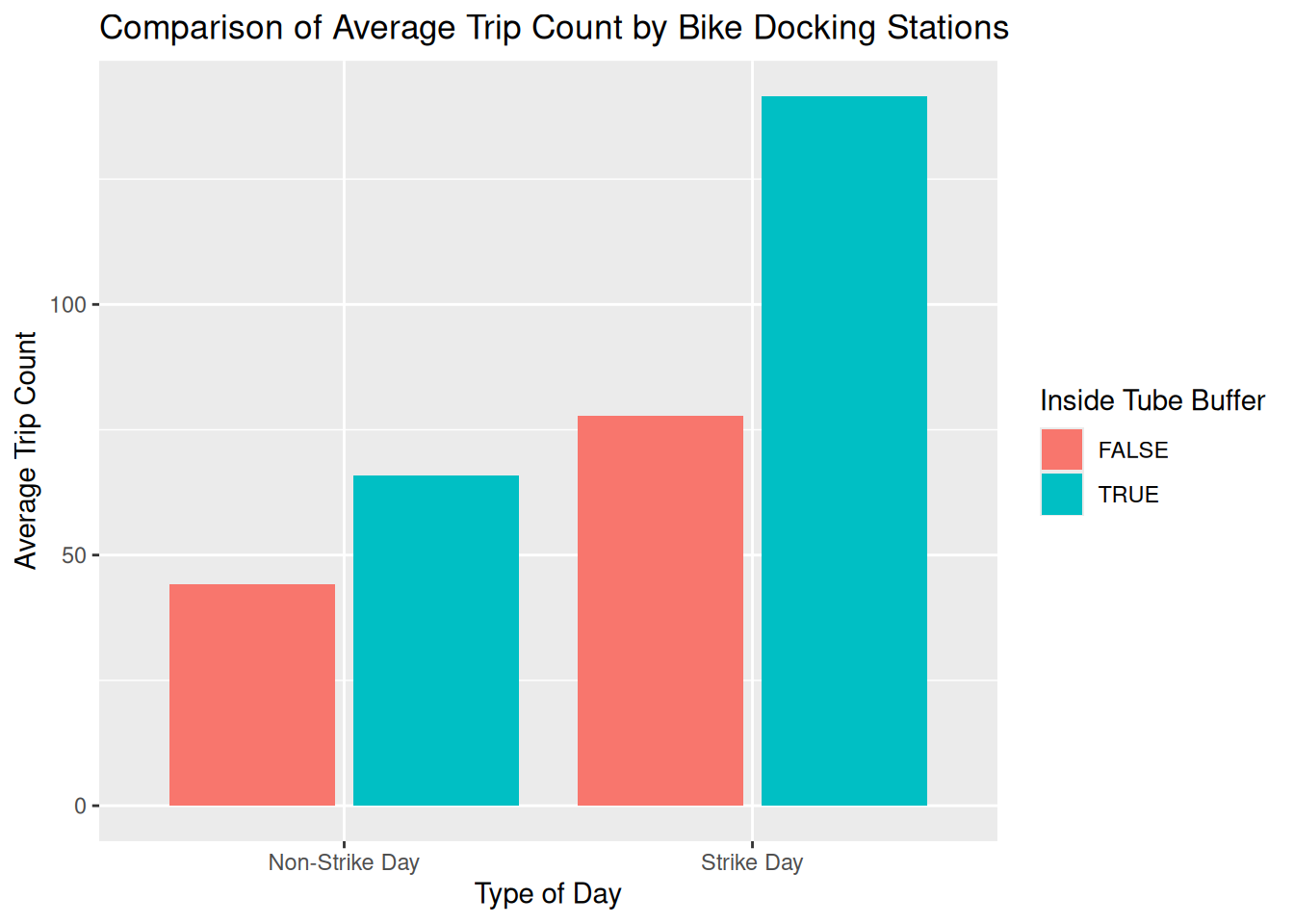
Finally, let’s compare the average number of trips (by trip origin) between the two types of bike docking stations: those inside the buffer and those outside the buffer.
What pattern did you observe?
# Compare trip patterns between bike stations near/far from Tube stations
bike_trips |>
  group_by(start_station_id, date, type_day) |>                            # Group by station, date, and day type
  summarise(count = n(), .groups = "drop") |>                              # Count trips per group

  # Join with docking station data to get buffer status (remove geometry for efficiency)
  left_join(
    bike_docking_stations |> st_drop_geometry(),                           # Remove spatial data for faster join
    by = c("start_station_id" = "station_id")
  ) |>

  # Calculate average trips by buffer status and day type
  group_by(inside_tube_buffer, type_day) |>                                # Group by buffer status and day type
  summarise(mean_count = mean(count), .groups = "drop") |>                 # Calculate mean trips

  # Create bar chart comparing the groups
  ggplot(aes(x = type_day, y = mean_count, fill = inside_tube_buffer)) +
  geom_bar(stat = "identity", position = position_dodge2()) +              # Side-by-side bars
  labs(
    x = "Type of Day",
    y = "Average Trip Count",
    fill = "Inside Tube Buffer",
    title = "Comparison of Average Trip Count by Bike Docking Stations"
  )
7.1 Summary
In this session, we explored how to effectively visualise origin-destination transport data to understand travel patterns and flows. We learned to create flow maps using desire lines and proportional symbols, and compare travel patterns across different transport modes.
Through hands-on analysis of the London Cycle Hire System during a Tube strike, we learned how transport disruptions create measurable changes in travel behavior and flows. The spatial analysis techniques covered — including buffer analysis and geometric operations—provide essential tools for understanding the relationship between transport infrastructure and user behaviuor. We practiced skills in data manipulation, joining datasets across different dates, and creating change of flow maps that effectively communicate complex spatial patterns.
These OD transport data visualisation and analysis capabilities are fundamental for evidence-based transport planning, and related skills can support decision-making for infrastructure development and policy interventions in real-world transport systems.
Reuse
Copyright
© 2025 Robin Lovelace