library(ggplot2)
data(mtcars)

ggplot(mtcars, aes(x = wt, y = mpg)) +
  geom_point() +
  labs(title = "Fuel Efficiency by Car Weight",
       x = "Weight (1000 lbs)",
       y = "Miles per Gallon") +
  theme_minimal()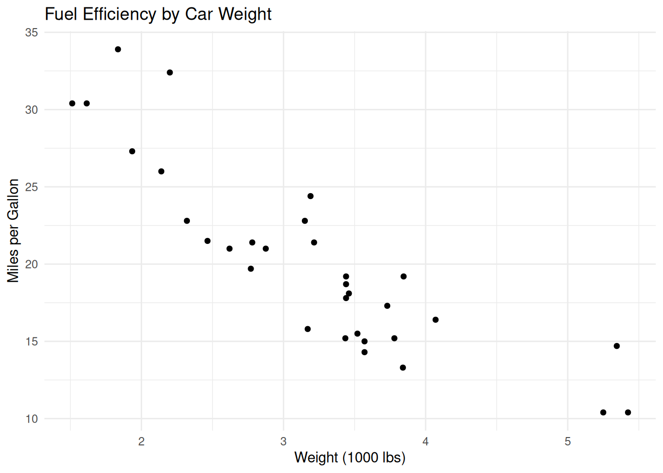
Data visualisation is a key part of research to communicate complex data and insights clearly. Effective visualisations help reveal patterns, trends, and relationships in your data, making your research more accessible and impactful.
Web applications allow you to share interactive visualisations and analysis with a wider audience.
ggplot2 is a powerful and flexible R package for creating high-quality graphics. ggplot is based on the Grammar of Graphics, allowing you to build plots layer by layer.
As an example, in the code below:
library(ggplot2)
data(mtcars)
ggplot(mtcars, aes(x = wt, y = mpg)) +
  geom_point() +
  labs(title = "Fuel Efficiency by Car Weight",
       x = "Weight (1000 lbs)",
       y = "Miles per Gallon") +
theme_minimal()- `ggplot(mtcars, aes(x = wt, y = mpg))` sets up the plot, specifying the data (`mtcars`) and mapping variables (`wt` for weight and `mpg` for miles per gallon) to the axes.
- `geom_point()` adds a layer of points, creating a scatterplot.
- `labs(title = "Fuel Efficiency by Car Weight", x = "Weight (1000 lbs)", y = "Miles per Gallon")` adds a title and axis labels for clarity.
- `theme_minimal()` applies a clean, minimal theme for publication-quality appearance.Example:
library(ggplot2)
data(mtcars)
ggplot(mtcars, aes(x = wt, y = mpg)) +
geom_point() +
labs(title = "Fuel Efficiency by Car Weight",
x = "Weight (1000 lbs)",
y = "Miles per Gallon") +
theme_minimal()
We will not be able to go into the details of the use of ggplot and other packages. But if you are interested, here are some great resources:
This is a test
Using the repository that you created yesterday. Try the following steps:
.gitignore file (this is optional)qmd document to: